Designing LinkedIn content for a brand that helps businesses stop fearing AI and start using it.
Graphic/Social Media Design
Sole graphic designer
AI & Tech, Education & Training
Canva
2025
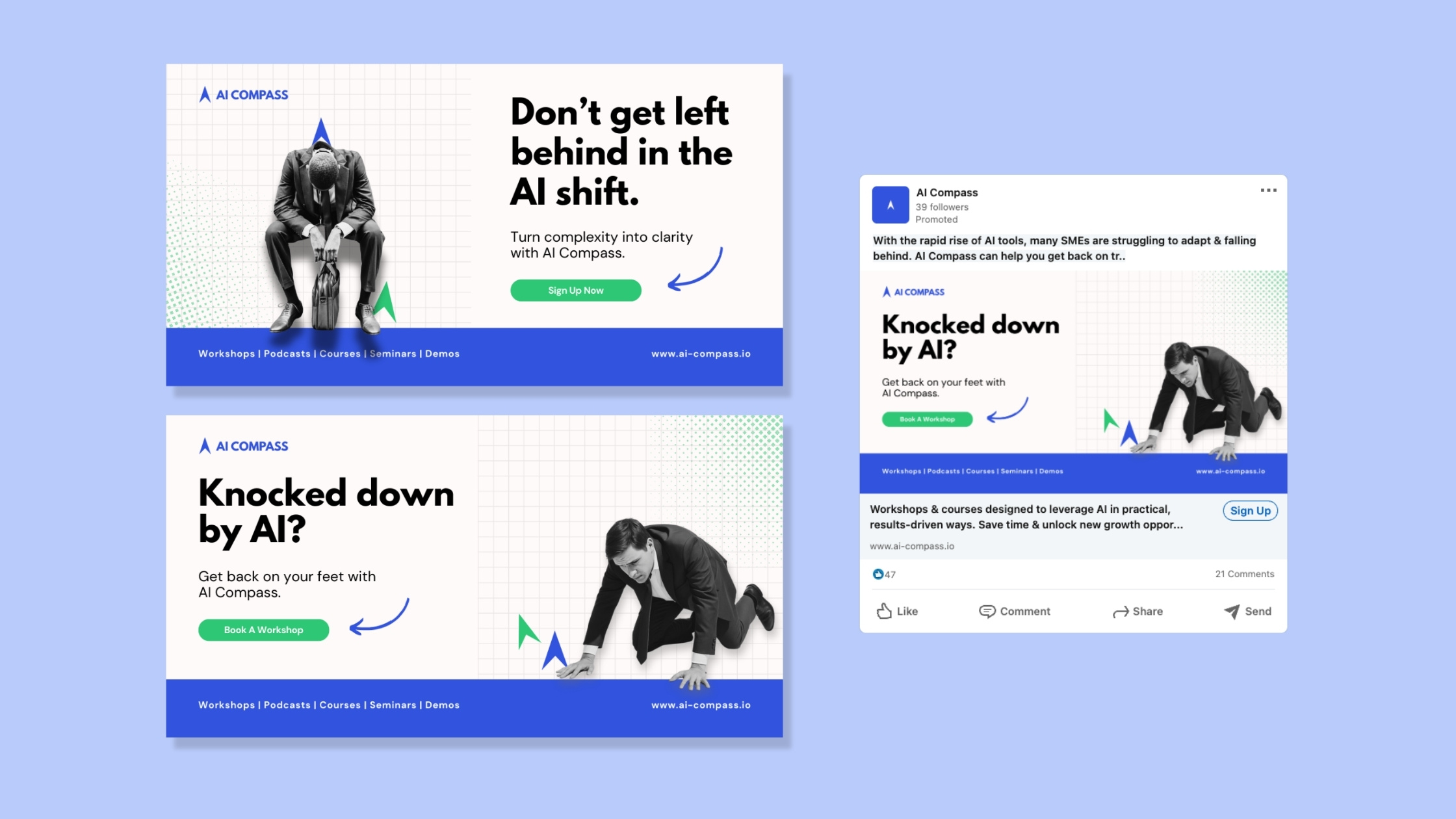
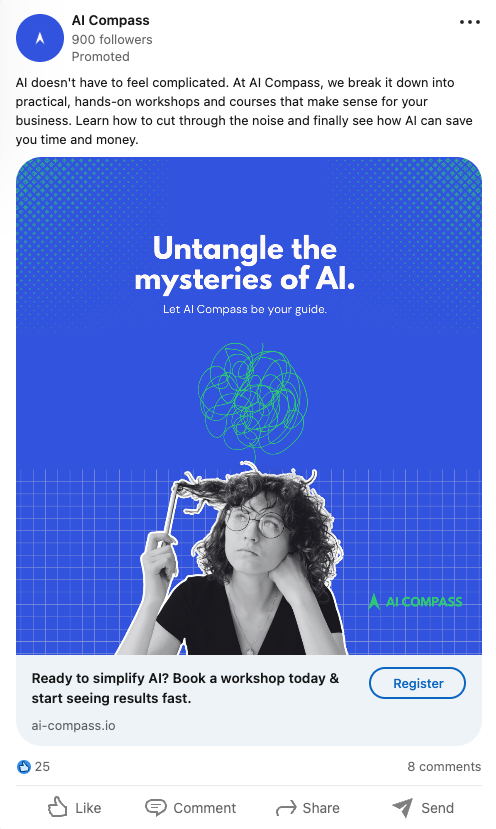
AI Compass is a fictitious company with a genuinely useful proposition: helping small and medium-sized businesses embrace AI without the overwhelm.
They offer workshops, courses, live demonstrations, podcasts, and seminars — all aimed at giving business owners and their teams the confidence to choose the right tools, apply them effectively, and stay competitive in a landscape that's changing faster than most can keep up with.
The brief was to design a suite of social media visuals that communicated that proposition clearly and credibly — without resorting to the sci-fi aesthetics and breathless hype that saturates the AI space.
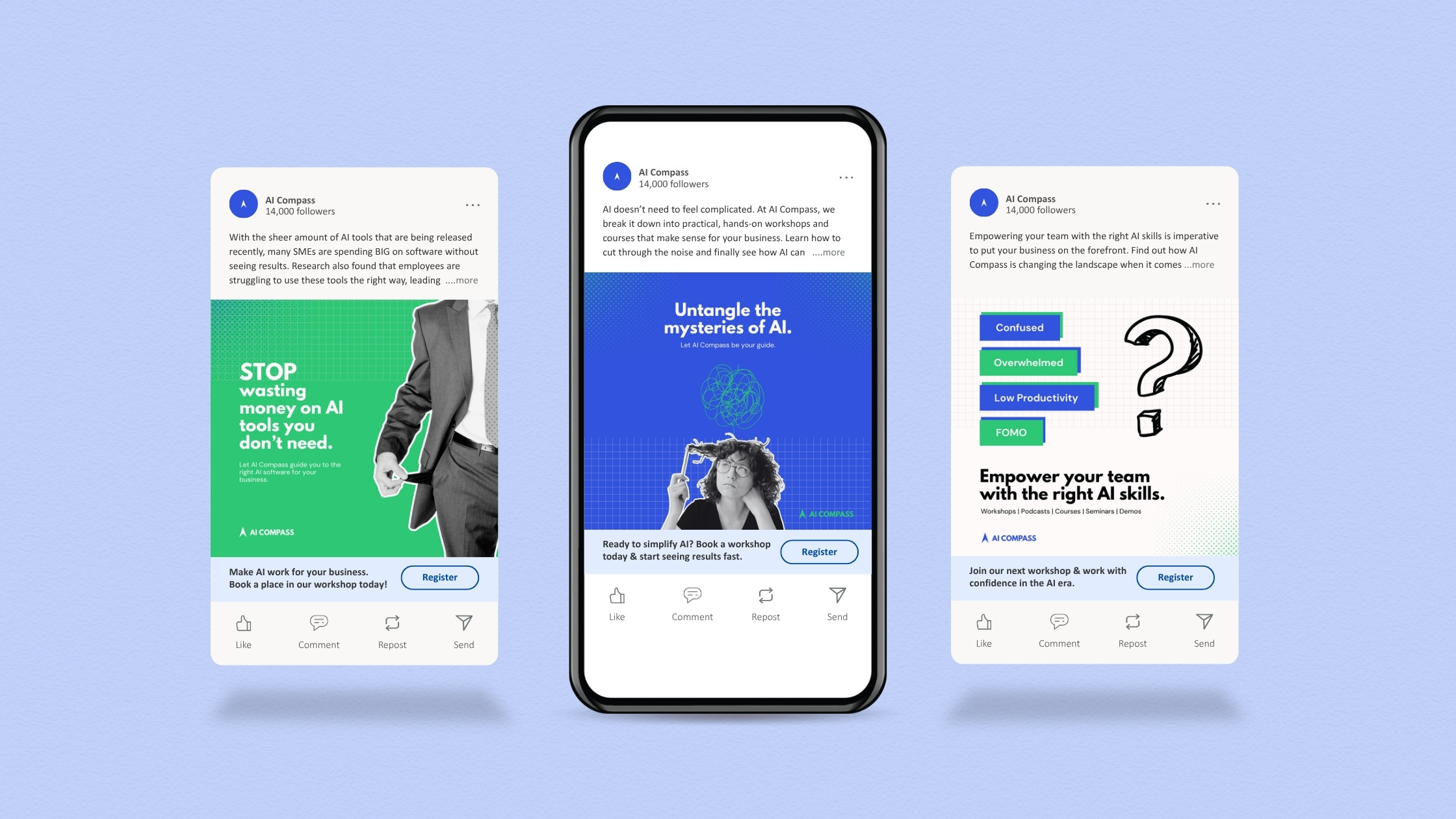
LinkedIn was the deliberate platform choice, and it shaped every creative decision that followed. SMB owners, CEOs, HR managers, and operations leads — the people who decide on team training and tool investments — are not necessarily be on Instagram looking for AI education. They're on LinkedIn, actively seeking industry insights and solutions to business problems.
The targeting granularity LinkedIn offers means the content could reach exactly the right decision-maker at exactly the right moment.That audience context informed the tone immediately. LinkedIn users are professional and time-poor — they scan before they read. The posts needed to lead with a clear benefit, not a clever concept. Intrigue was built in through restraint: revealing enough to earn a click, not so much that there was nothing left to discover.
The design direction followed the same logic. Clean layouts, strong typographic hierarchy, and short benefit-driven headlines — nothing that required effort to decode. In a feed full of noise, clarity is the differentiator.
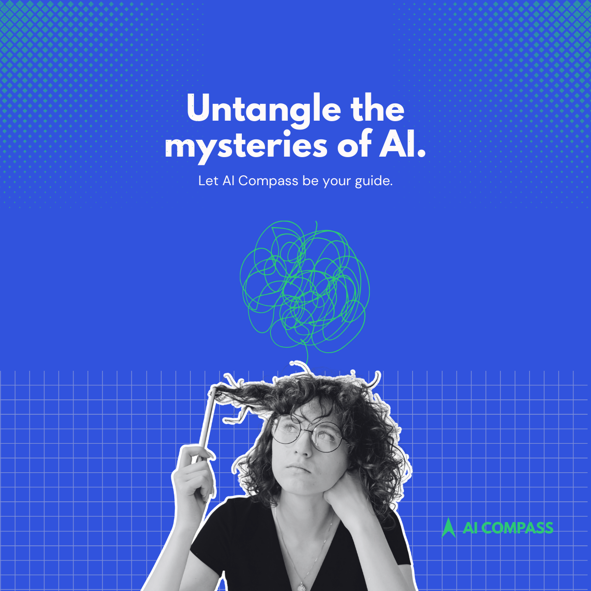
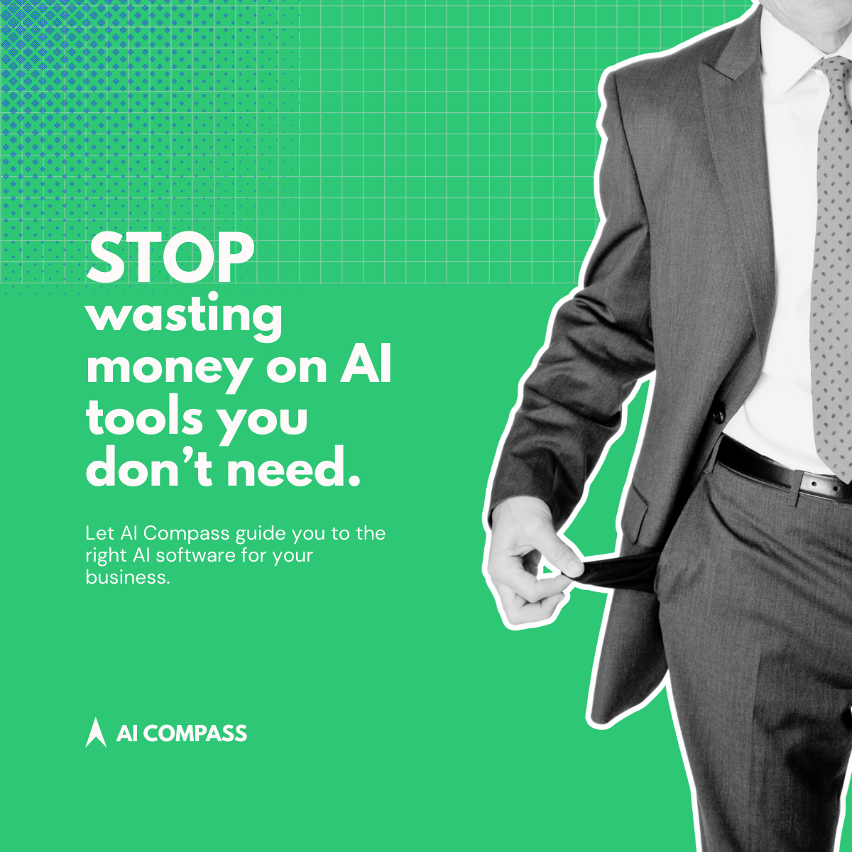
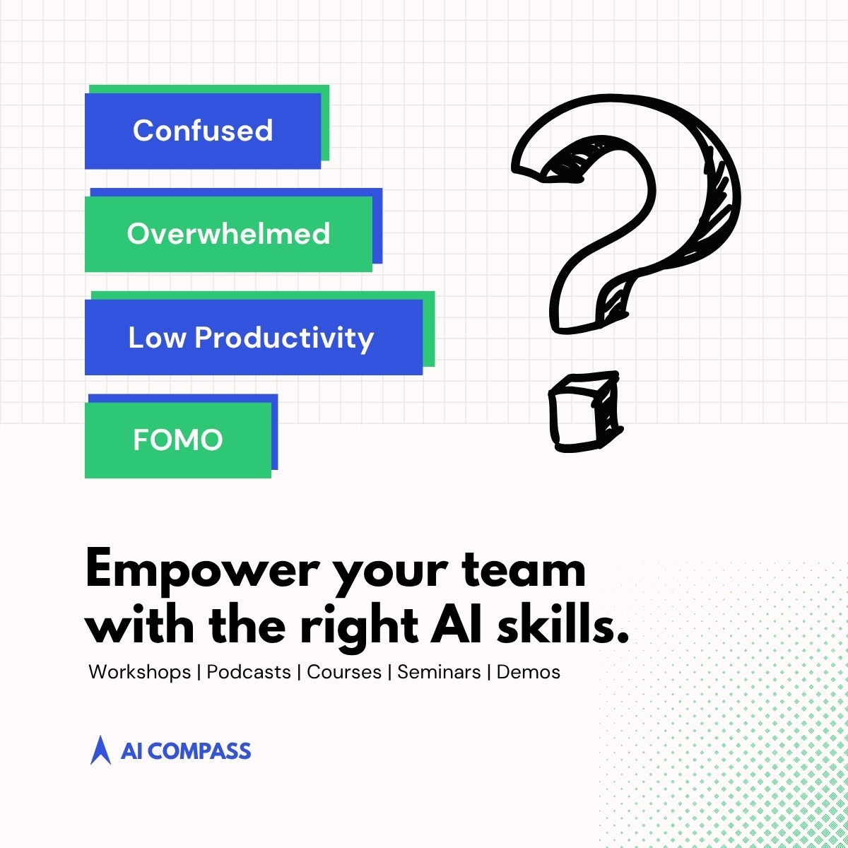
The colour palette of blues and greens was chosen to position AI Compass precisely where it needed to sit in its audience's mind — trustworthy enough to hand over a training budget, forward-thinking enough to be credible on the subject of AI. Blue signals reliability and stability; green signals growth and progress. Together they communicate a brand that guides rather than dazzles, which is exactly the right register for a company demystifying technology for non-technical audiences.
Consistent whitespace, a dominant headline, a supporting visual cue, and a concise value proposition on each post create a hierarchy that works at scroll speed. The tone is direct and human — a deliberate counter to the jargon-heavy, hype-driven language that makes most AI content feel inaccessible to the very people it's meant to serve.
While designed with LinkedIn as the primary platform, the visual language translates cleanly to other professional and social channels without adaptation — a mark of a design system that's genuinely cohesive rather than platform-dependent.
As a concept project, the posts weren't deployed or tested against a real audience — so engagement, CTR, and conversion data remain hypothetical. The next iteration would involve A/B testing headline variations and visual treatments against each other with a live campaign, using LinkedIn's campaign manager to track performance by audience segment.