Google Display ad redesign project, proving that the gap between a forgettable ad and an effective one is almost entirely a design problem.

Graphic/Google Ads Design
Sole graphic designer
Restaurant & hospitality
Canva, Photoshop
2025
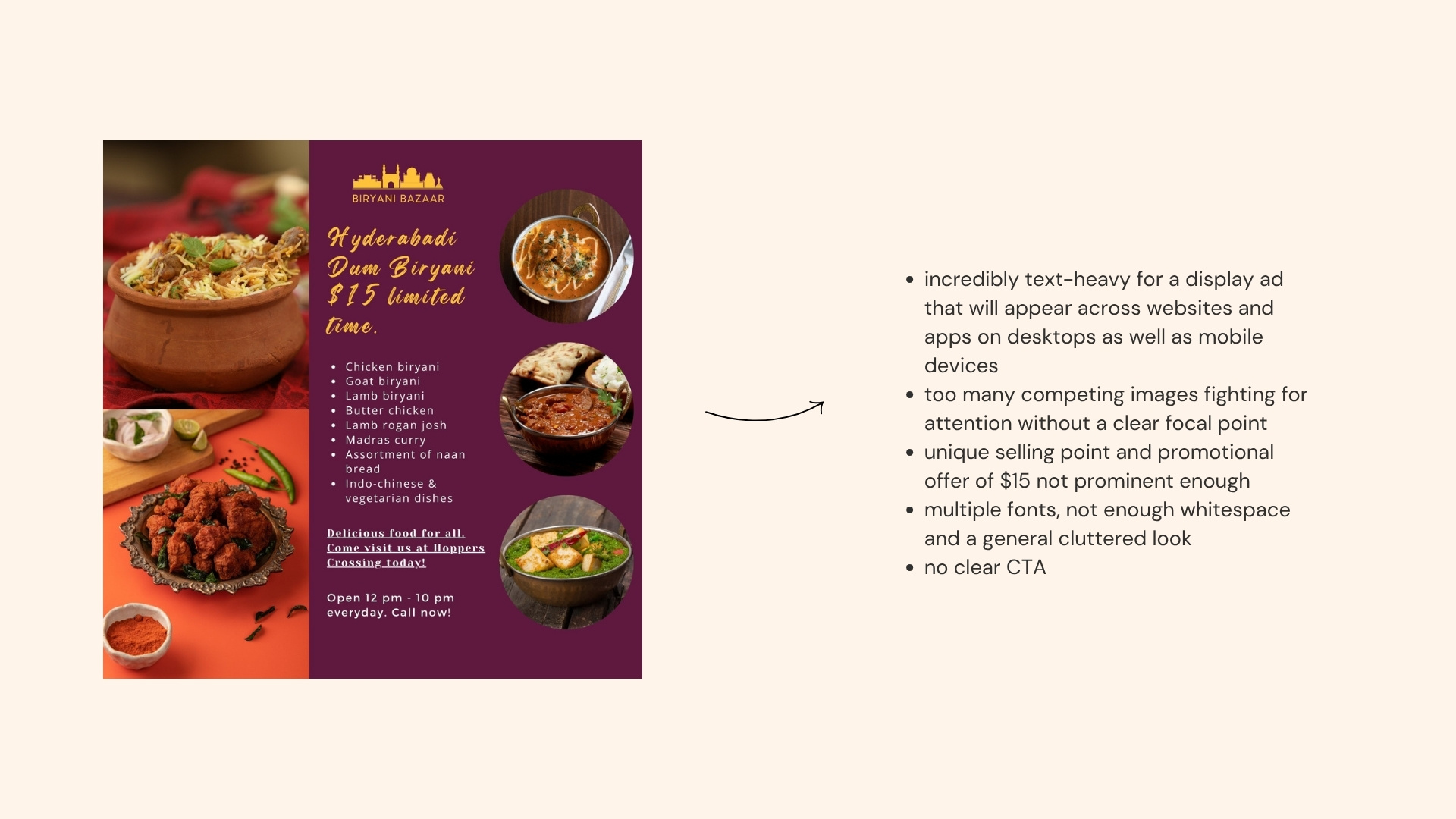
After nine years years running digital marketing campaigns, I'd seen enough bad Google Display ads to know exactly what was going wrong — and why. Cluttered layouts, multiple fonts fighting for attention, a call-to-action buried under competing images, and a value proposition that required actual effort to find. These aren't rare exceptions; they're more often than not the norm.
Biryani Bazaar is a fictitious restaurant inspired by a real local spot near me that was running exactly these kinds of ads. I used it as the vehicle for a before/after redesign — deliberately recreating the common mistakes first, then rebuilding the ad from scratch using the principles that actually drive engagement and conversions.
Recreating the "before" version faithfully was the first task — not to mock it, but to use it as an honest benchmark. If you can't articulate exactly what's wrong, you can't fix it.
My experience managing paid digital campaigns meant I could name each problem precisely — and more importantly, explain why it mattered beyond aesthetics. Cluttered layouts don't just look messy; they create decision fatigue that costs clicks. Unclear messaging doesn't just confuse people; it wastes impressions and affects click-through rates. Understanding the performance consequences of each design flaw made the brief for the redesign unusually specific.
The redesign constraint was deliberate too — retain the restaurant's existing purple and yellow colour palette rather than start from scratch. Working within an existing brand identity rather than creating one is closer to real agency work, and it kept the focus squarely on what layout, hierarchy, spacing, and typographic consistency can achieve on their own.
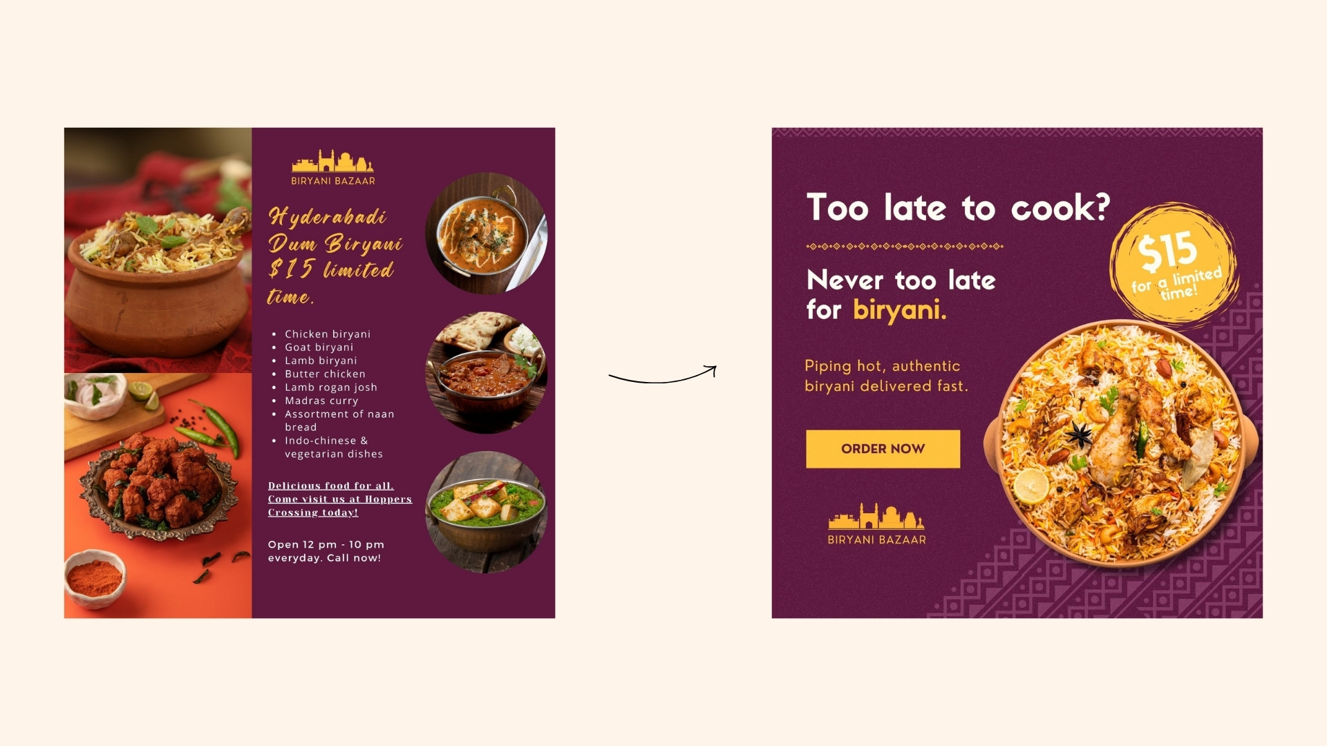
Here is a recreation of the 'before' version that details some of the key points that weren't working for the ad.
The redesigned version and why I think this would be better in terms of performance.
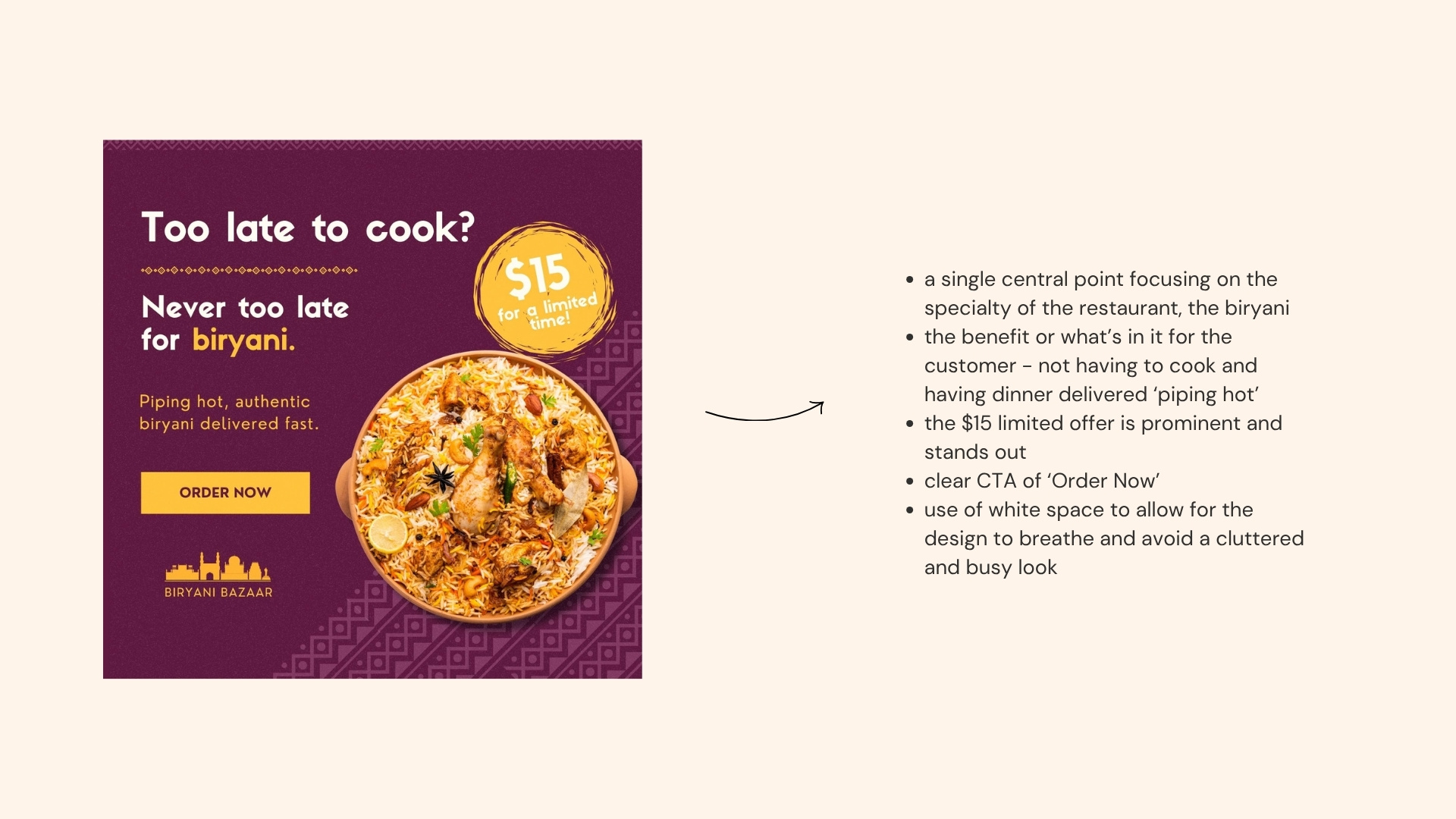
The redesigned ad applies four principles that the original ignored: a single clear message, a visible value proposition, one strong CTA, and a layout with enough breathing room to let each element do its job.
The purple and yellow palette was retained but rebalanced — refined through layout and spacing rather than replaced, creating focus and harmony where the original had competition and clutter.
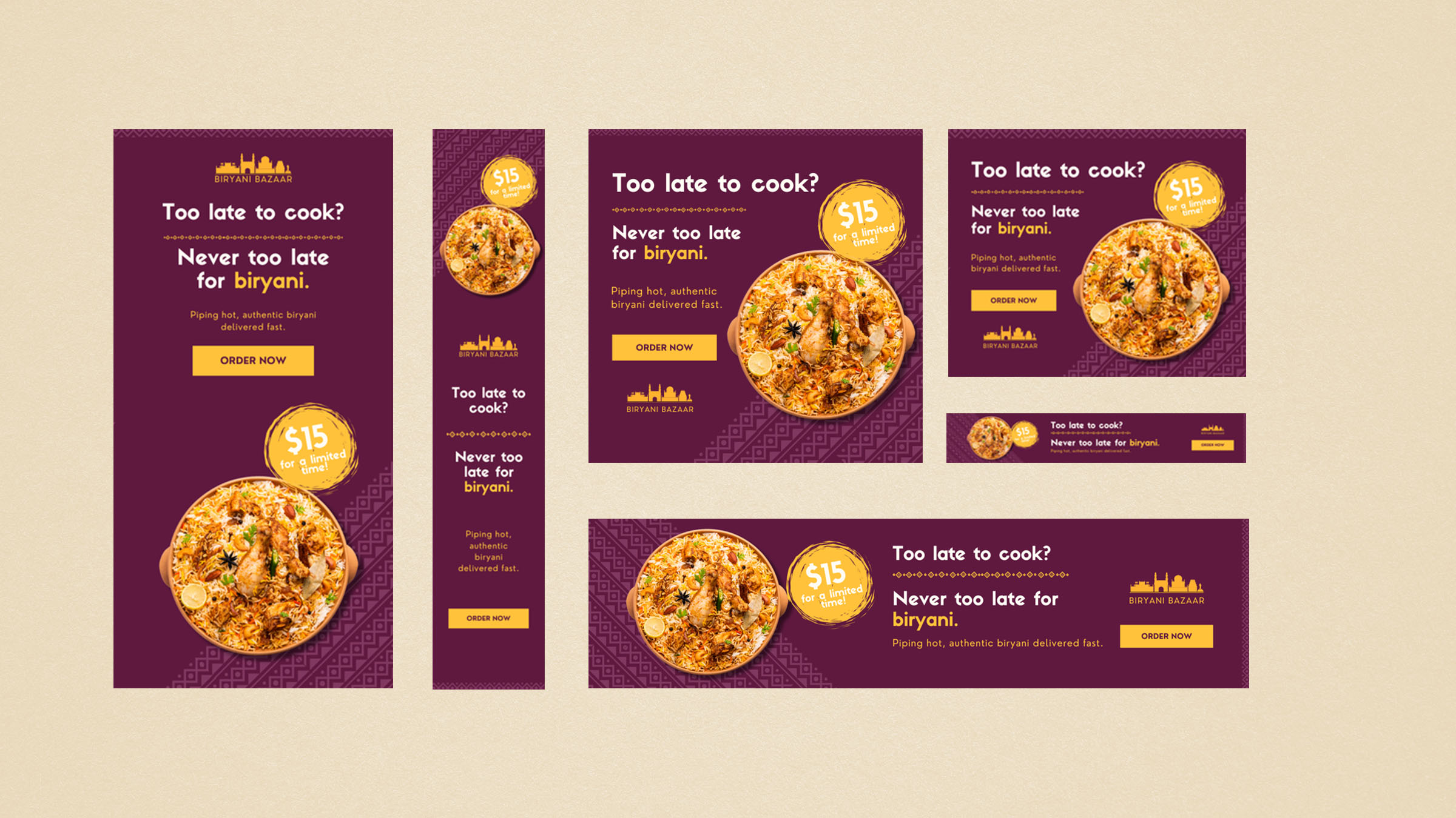
The project spans multiple ad sizes optimised for desktop and mobile placements, stress-testing the design decisions at smaller dimensions where legibility and visual impact matter most. A hierarchy that works at 728×90 is a hierarchy that actually works.
The honest limitation of this project is that the "after" version hasn't run. Without live campaign data — impressions, CTR, conversion rate — the improvement remains a design argument rather than a proven one.
The next step would be A/B testing the two versions against each other with a real budget, which would either validate the design principles or reveal something more interesting: that the audience responds to something neither version anticipated.
That said, the principles applied here aren't speculative. They're the same ones that informed campaign creative decisions throughout my marketing career — and the results of getting them right or wrong were measurable every time.