Connecting people who want to give back to communities that need them. A full end-to-end app design project, from research to high-fidelity prototype.
UI/UX Design, App Design
UI/UX Designer, Researcher
Social impact, Community
Figma
2025
Most people want to volunteer. The problem wasn't apathy. Research showed that people genuinely wanted to contribute to their communities — they were just hitting friction at every turn. Existing volunteering platforms focused almost entirely on manual or event-based work, leaving skilled professionals with no clear way to offer what they actually had to give. And for people who simply wanted to help but didn't know where to start, the discovery experience was, to put it charitably, not great.
The goal was to design an app that served two distinct user groups simultaneously: time-poor professionals who wanted to contribute their skills, and community-minded individuals who just needed a simple, trustworthy way to find nearby opportunities.
Supastarz was designed to fix that: a community-based app that matches people's skills and availability with local causes that actually need them.
I conducted user interviews and built empathy maps to understand both audiences before touching a single screen. A consistent theme emerged: people genuinely wanted to help but felt guilty about not doing more — because the existing options made it harder than it needed to be.
From the interviews, two primary personas took shape. Daniel, a freelance graphic designer wanting to offer his creative skills to genuine causes, but finding that most volunteering platforms only catered to manual or event-based work. And Leila, a full-time retail worker who wanted simple, short-term opportunities nearby — without a lengthy application process standing between her and showing up.


A competitive analysis of GoVolunteer, Meetup, and Nextdoor surfaced three design patterns worth building on:

Map and category based discovery
Aids navigation and location relevance

Profile-centric interfaces
Highlight personal skills, availability and causes supported

Gamified impact tracking
Badges/progress meters encourage continued participation
Research findings were then crystallised into a clear problem statement that would guide the ideation phase:
Most people want to contribute to their communities but find it hard to make the time — and those who do make the time often don't know where to start. Finding relevant, nearby volunteering opportunities is harder than it should be, and for people who want to offer a specific skill rather than just show up, existing platforms offer very little help. The gap between wanting to give back and actually doing it is almost entirely a discovery and access problem.
After defining the core problems during user research, I reframed them as “How Might We” questions to encourage ideation and solution-oriented thinking.
Users want to share their skills but don't know how or where to start
How might we make it easy for users to discover community needs that align with their unique skills?
Users want flexibility due to busy schedules
How might we allow users to choose volunteering opportunities that fit their time and availability?
Some users don't have specific skills but still want to help their local community
How might we include users who just want to contribute their time, not necessarily their expertise or skills?
People lose motivation when they can't see their impact
How might we show volunteers the real difference they're making through their contributions?
I then ran a Crazy 8s session to rapidly explore potential features — generating eight distinct ideas in eight minutes. The strongest concepts were a dual-category interface separating skill-based and time-based volunteering, a skill tagging system, a smart match algorithm, an interactive map for local discovery, in-app messaging, one-tap event registration, an impact tracker, and a community feed.

From those eight, the most viable features for an MVP were prioritised based on what would most directly address the pain points surfaced in research. The dual-category interface, smart matching, and one-tap registration were the non-negotiables. Messaging and the community feed were strong candidates for a second release.
I also kept returning to a question that my marketing background made instinctive: not just "is this usable?" but "what makes someone come back?" Impact tracking and personalised recommendations weren't UX nice-to-haves — they were retention mechanics. That framing shaped which ideas made the cut.
I built low-fidelity wireframes in Figma and connected them into a clickable prototype mapping the core user flow: finding an event, viewing details, registering, and receiving confirmation.
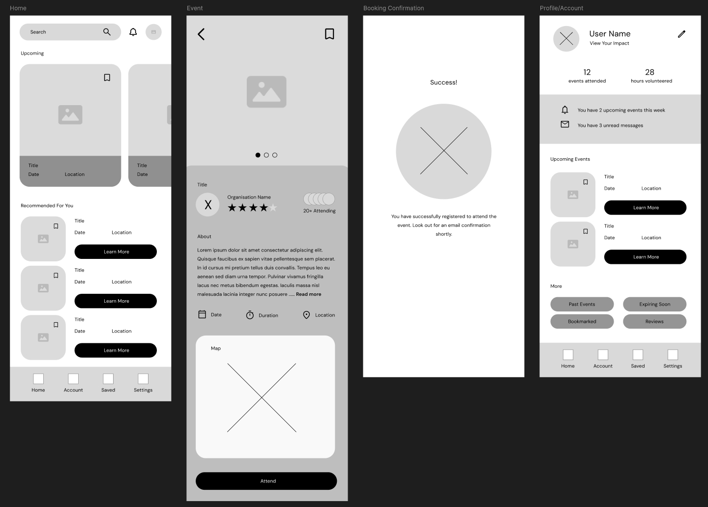
This became the basis for an unmoderated remote usability study with five participants across Australia. The study tested three key tasks — browsing opportunities, offering help, and confirming participation — and produced three clear findings:

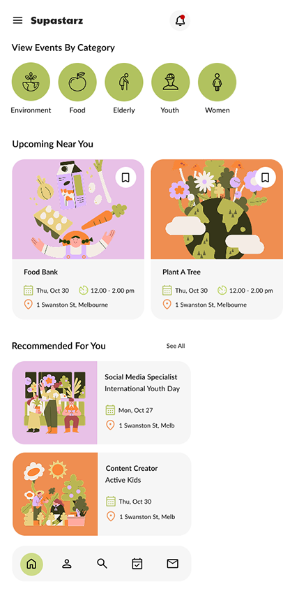
Users wanted to browse events by category:
rather than scrolling through a list. The lack of filtering made decision-making slow and frustrating

Users wanted to share events with friends:
the social dimension of volunteering had been underestimated in the first draft

Users wanted to message organisers directly:
before committing; they needed a way to ask questions and feel confident before registering
There were a few common themes that emerged from the usability study and 3 features stood out - things that needed a bit of tweaking for a minimum viable product or MVP launch of the app. Users wanted category browsing, so a horizontal scrollable category row was added to the home screen, giving immediate visual filtering without requiring a search query. Users wanted to share and message, so a share icon and direct messaging button were introduced on the event detail screen, making both actions available in a single tap.
Additionally, Search was relocated from the top of the screen into the bottom navigation bar, bringing it into thumb reach without requiring a grip adjustment. A small change that made a meaningful difference to how the app felt to use one-handed.


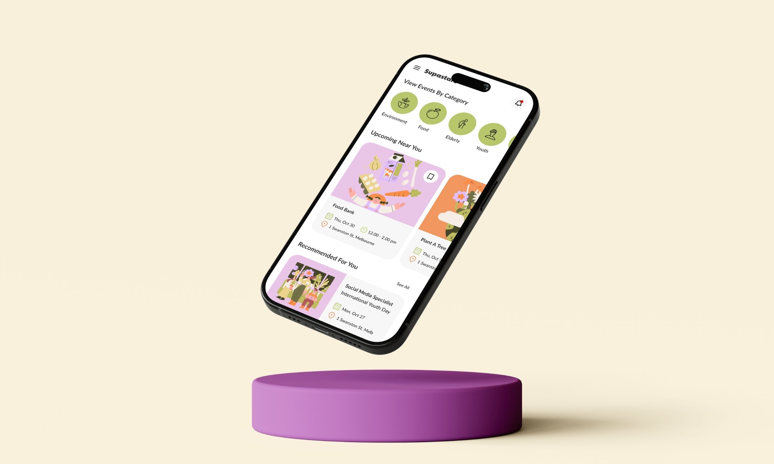
The final Supastarz app spans nine screens covering the complete user journey: welcome, home, event discovery (explore and matches views), event detail, booking confirmation, user account, search, and messaging. Below is a screenshot of my Figma prototype along with a close-up of a few screens.
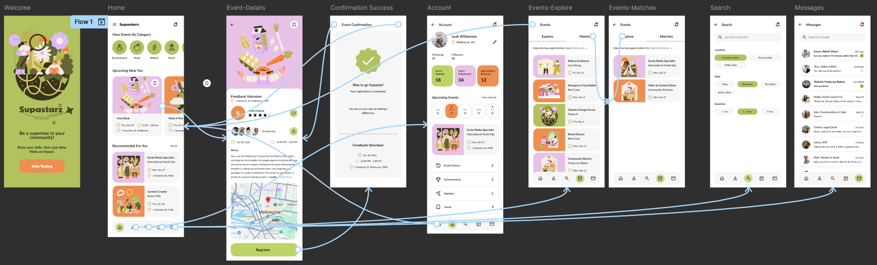
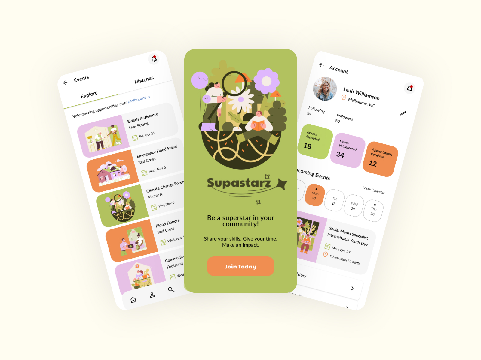


The visual language — warm olive greens, soft lavender and terracotta, rounded UI elements, and Drawkit illustrations — was built to feel warm and human rather than corporate and transactional. The style guide documents the complete design system: Paytone One for the logomark, Lato for all UI text, a four-colour palette, icon sizing standards at 26×26px using the Relume Figma kit, and illustration usage guidelines. The interactive Figma prototype connects the full primary user flow end-to-end.

The app as designed serves volunteers well. But the other side of the platform — the organisations posting opportunities — was largely out of scope for this iteration, and that's the obvious next step. Community groups managing multiple volunteers, tracking registrations, and communicating with dozens of people have a completely different set of needs. A next iteration would treat that as a separate but connected product rather than an afterthought. An informational website for the organisation is also a logical next step, encouraging users to download the Supastarz app and sign up for community volunteering.
Accessibility was another identified gap — voice search in particular. A platform built around inclusion probably shouldn't require perfect fine motor control to use well.
The broader lesson from this project: designing for a dual user base means you're constantly one decision away from optimising for one group at the expense of the other. Keeping both Daniel and Leila visible throughout — literally, their personas stayed on screen during every design session — was what stopped that from happening.