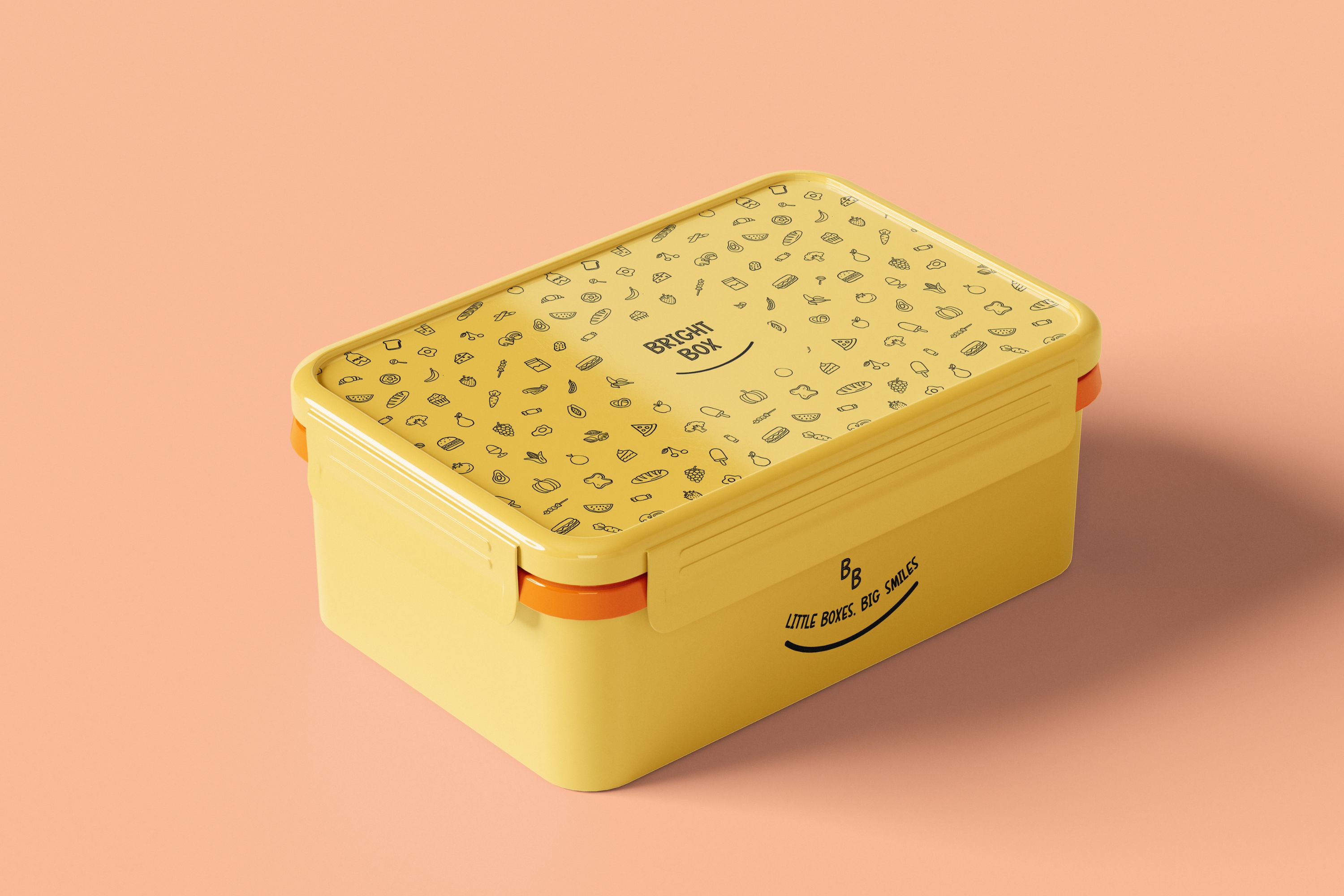
brightbox
A playful brand concept for a kids' lunchbox delivery service designed to help busy parents serve nutritious meals with ease
2025
Visual & Brand Identity
Photoshop, Procreate
Kids, Parenting, Lifestyle
Project overview
This project covers the full brand development process, from research and strategy through design execution and brand applications and includes the following deliverables:
- logo
- typography
- colour palette
- imagery/illustrations
- brand voice and messaging
- applications
research
BrightBox is designed for two audiences: the primary target market of parents who are the decision-makers and will actually subscribe to the service AND the children who are the secondary market and who will ultimately use and enjoy the product.
Primary audience - parents (decision-makers)
Parents, particularly mums aged 25 - 45 are generally time-poor, juggling work and school routines and looking for healthy, reliable lunch solutions their kids will actually eat. They value convenience, nutrition, food safety and sustainability and are willing to pay a premium for quality.
secondary audience - children (end users)
Kids aged 5 - 12 care about fun, colour and variety. They respond to playful designs, interesting foods and anything that feels exciting compared to the standard lunchbox. Peer influence and novelty also shape their preferences. Because children often influence parents' purchasing decisions, BrightBox's branding balances parent trust with kid-friendly appeal.
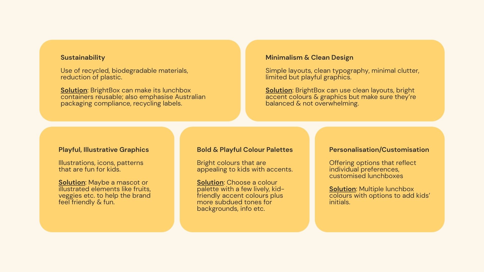
design trends
My research uncovered design trends that were incorporated into the visual direction, guiding everything from colour choices to typography and illustration style.
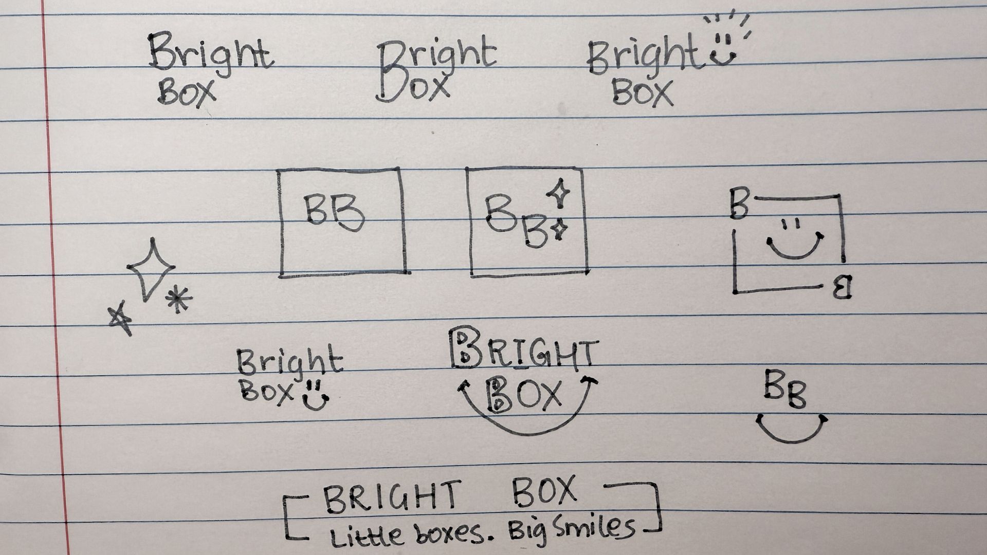
ideation
Initial sketches explored potential logo concepts, supporting elements and typography directions. Because BrightBox is a new start-up, the brand name needed to be the hero, thus ensuring strong visibility, awareness and easy recognition from the outset. I also experimented with playful elements like smile curves and subtle smiley motifs to reinforce the tagline "Little Boxes. Big Smiles."
Typography exploration focused on styles that felt simple, friendly and kid-appropriate, capturing the fun, approachable personality essential for a children's brand.
first draft
BrightBox is designed for two audiences: the primary target market of parents who are the decision-makers and will actually subscribe to the service AND the children who are the secondary market and who will ultimately use and enjoy the product.
Primary audience - parents (decision-makers)
BrightBox is designed for two audiences: the primary target market of parents who are the decision-makers and will actually subscribe to the service AND the children who are the secondary market and who will ultimately use and enjoy the product.
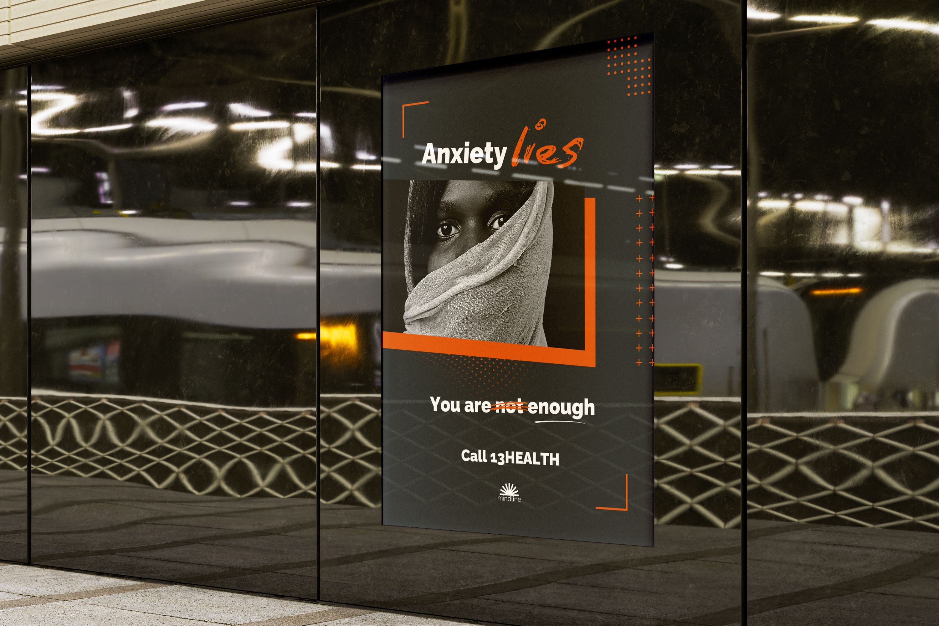
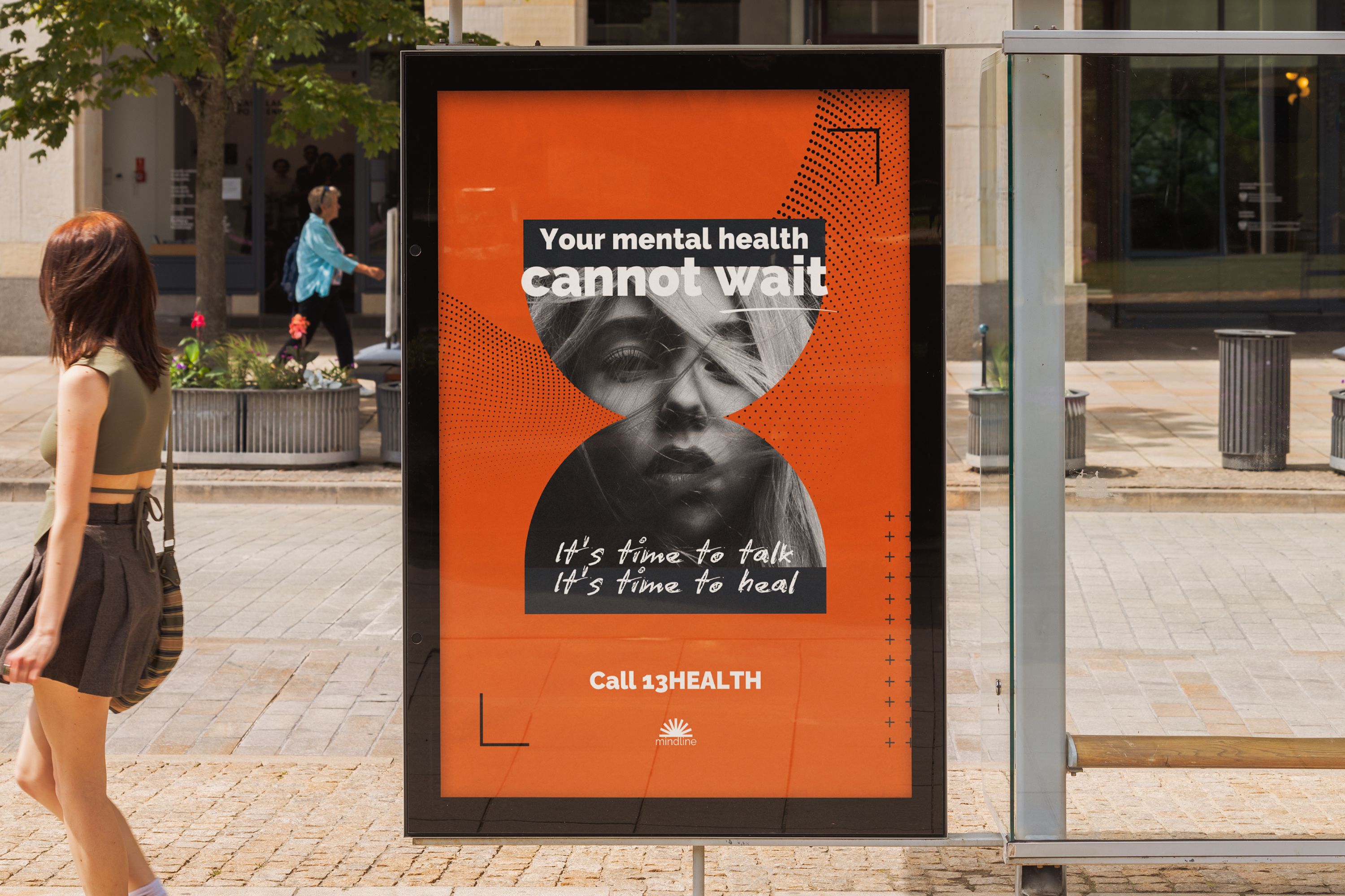
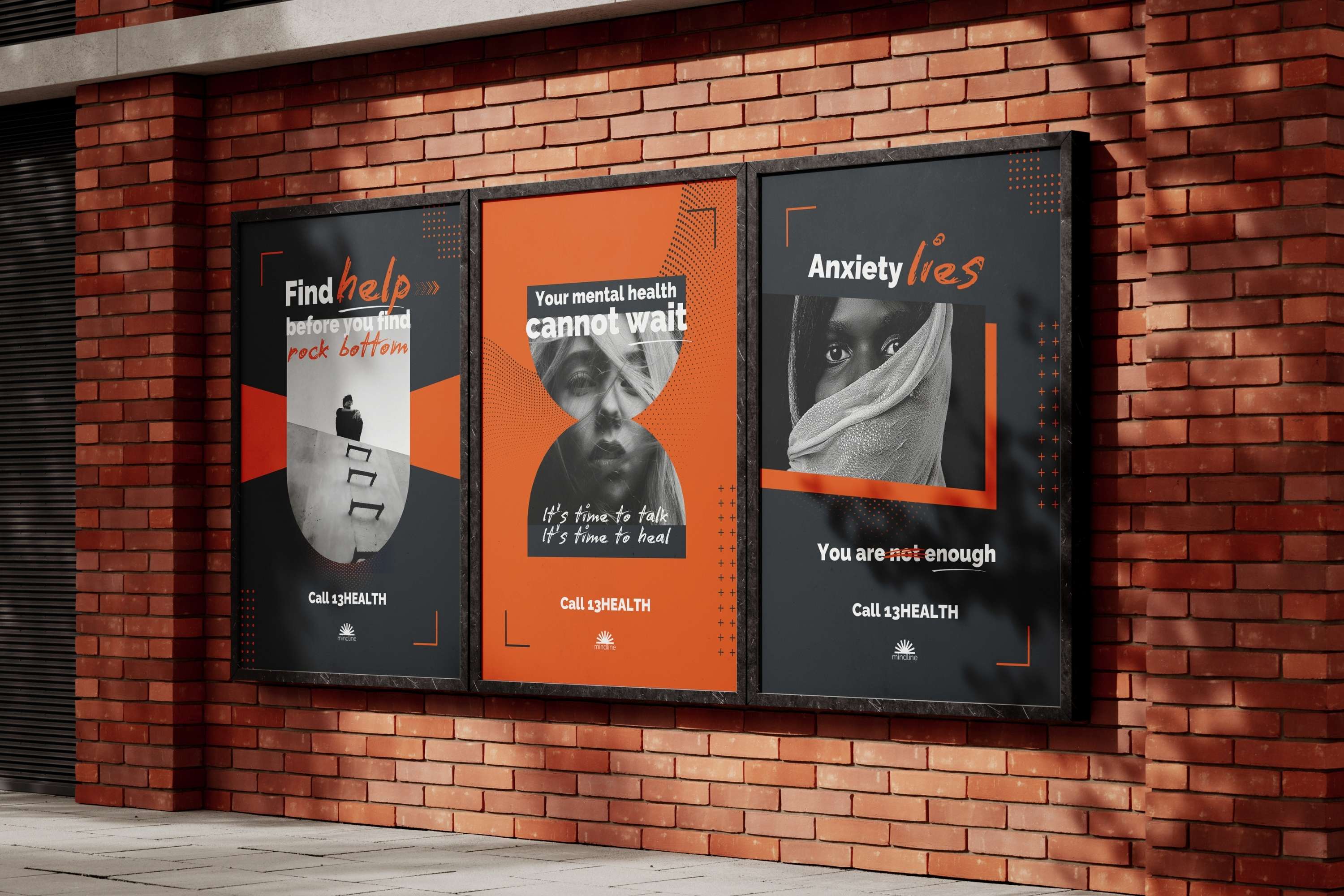
Campaign applications
These mockups demonstrate how the Mindline campaign could translate into real environments, creating moments of reflection in everyday settings and making mental health awareness more visible in the places people pass by every day.