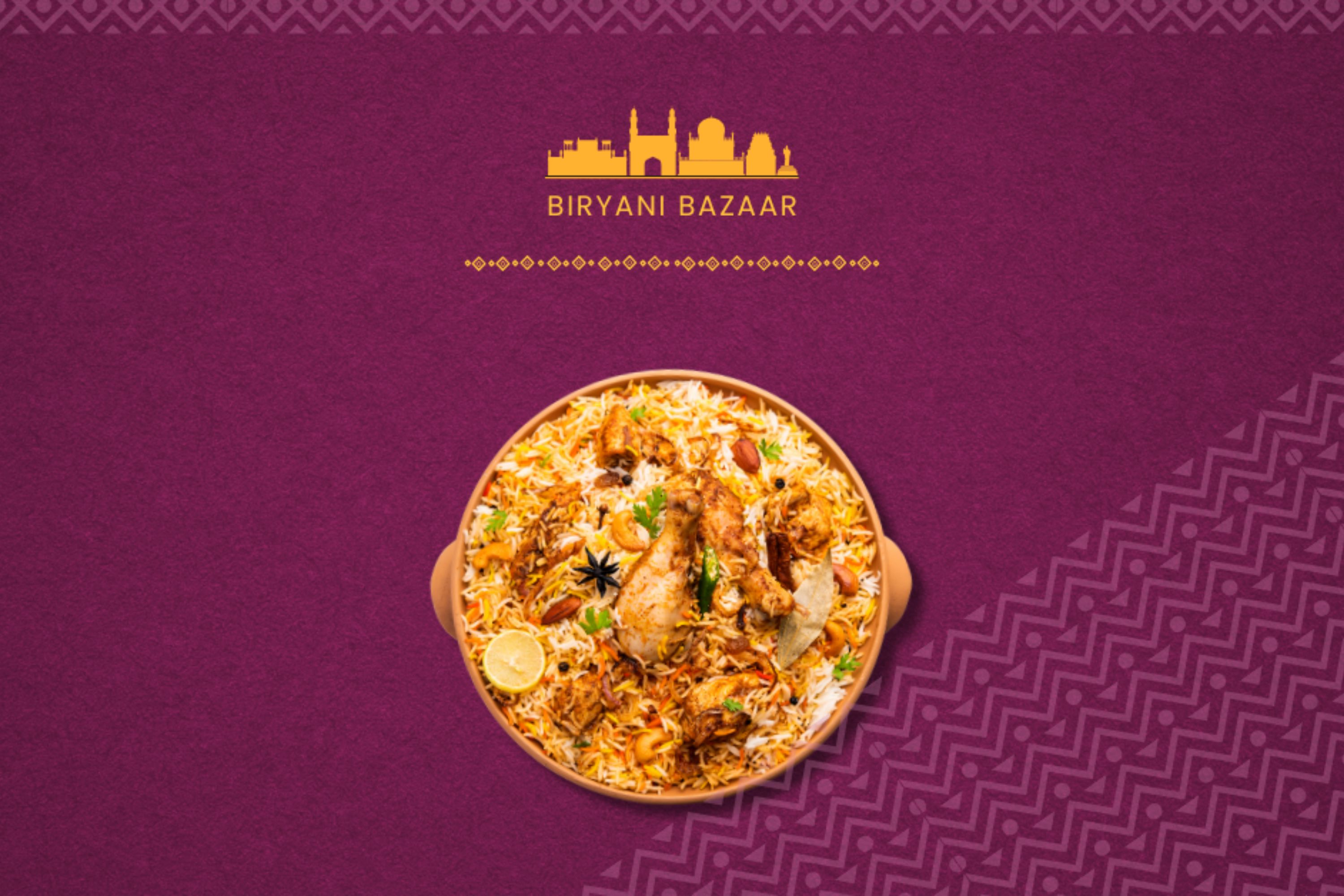
biryani bazaar
Redesigning Google Display Ads with focus, clarity and conversion in mind.
2024
Graphic Design
Photoshop
Restaurant, Food & Hospitality
Project overview
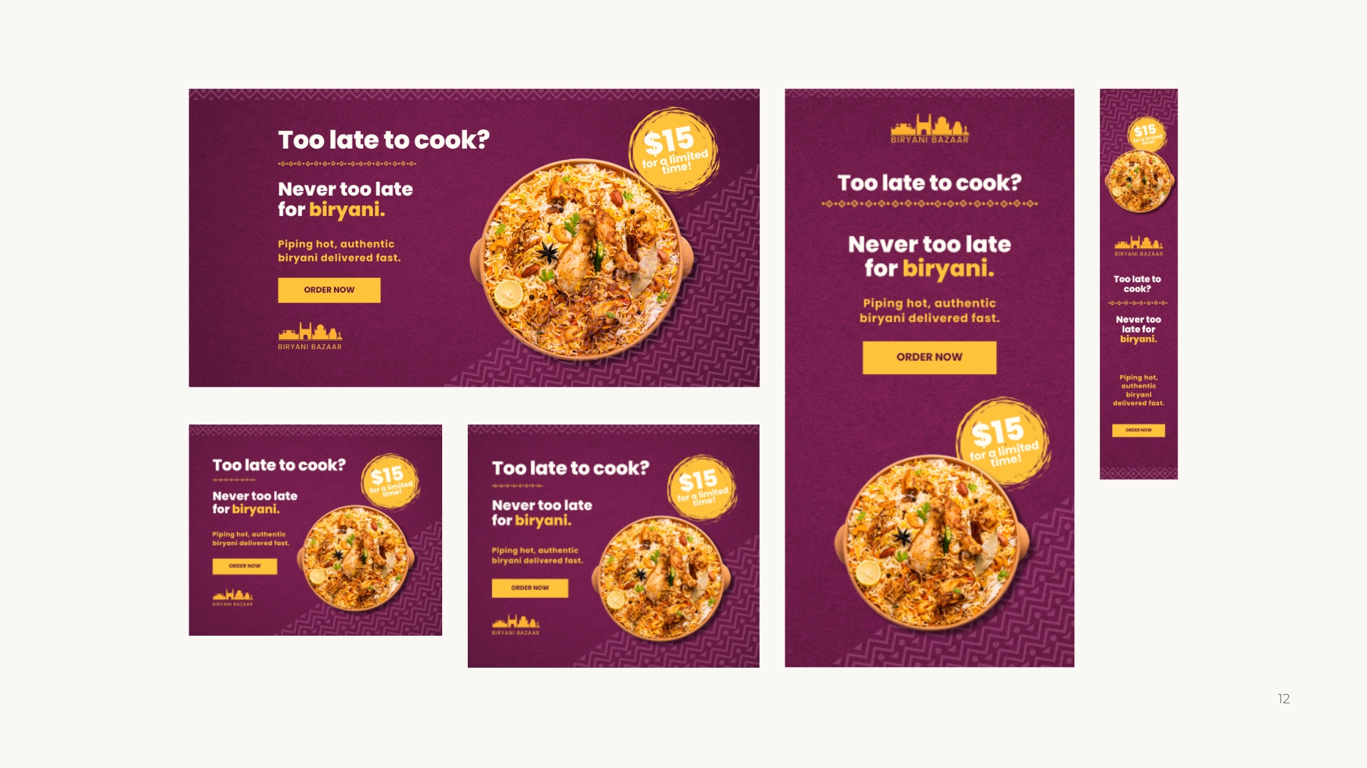
designing the ads
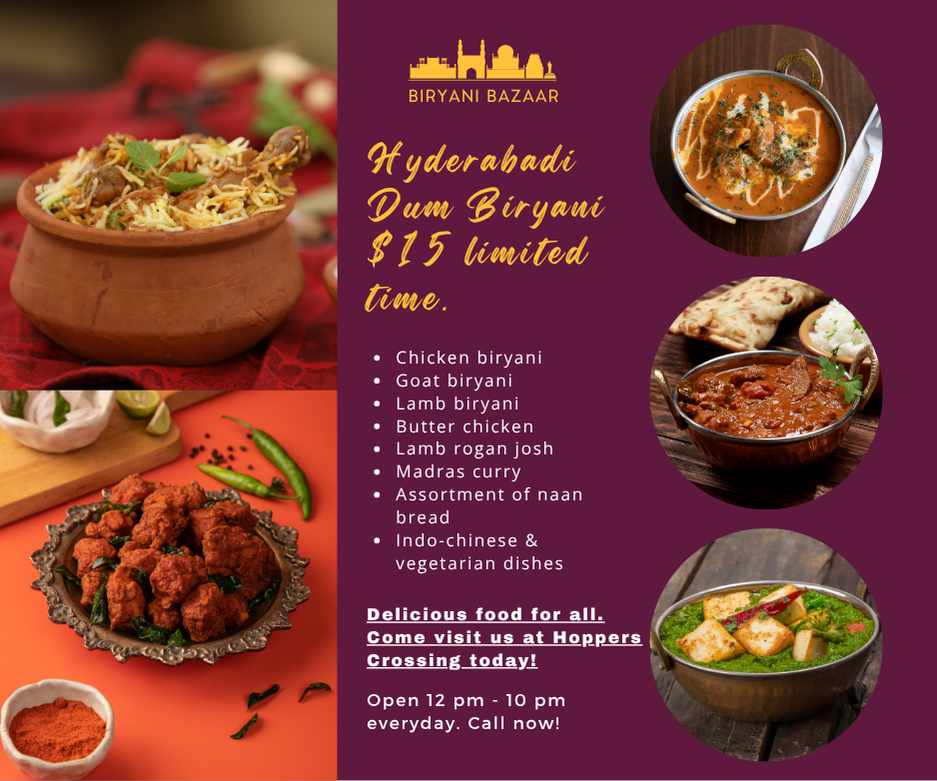
The 'before' version (below on the left) showcases the common mistakes often seen in ads - too many fonts, multiple competing images, unclear messaging and no strong value proposition and call-to-action (CTA). These elements create visual noise, causing users to scroll past without understanding what's being offered.
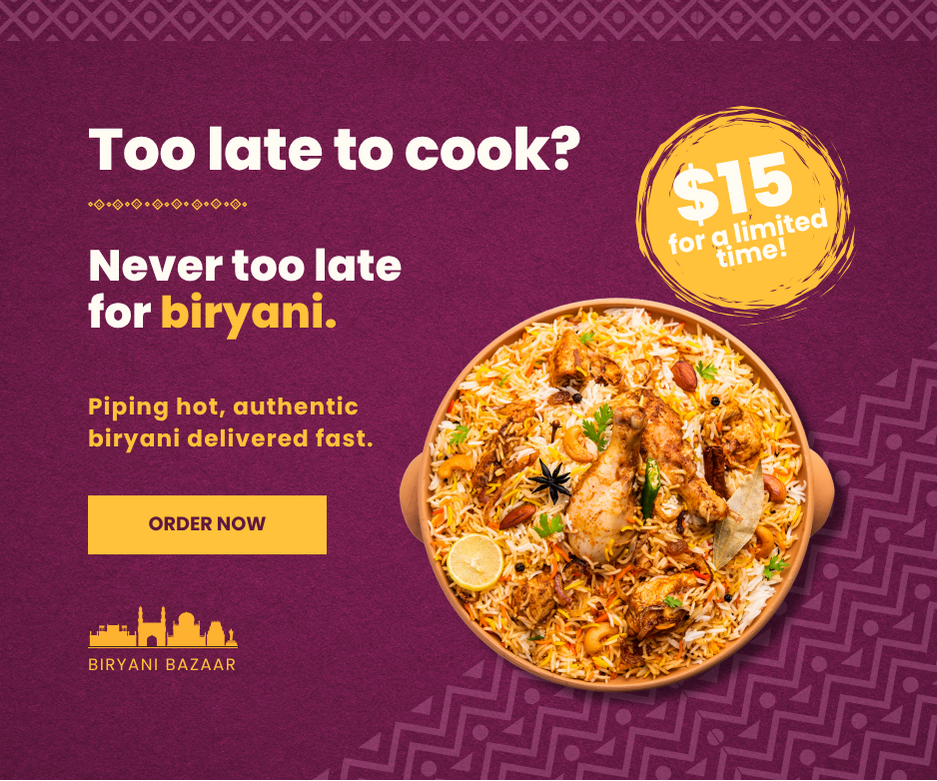
The redesigned version (on the right) applies the fundamental principles of effective ad design: a single clear message, a visible value proposition, strong CTA and a clean layout with defined hierarchy. The colour scheme of purple and yellow was retained to stay consistent with the restaurant's brand identity, not chosen by me but refined and balanced through layout and spacing to create more focus and harmony.
Campaign applications
The project includes multiple ad sizes, optimised for both desktop and mobile placements, with an emphasis on legibility and visual impact ensuring that the message stands out even at smaller dimensions. The final result highlights how small design decisions such as consistent typography, visual breathing space and a single focal point can transform an ad from forgettable to conversion-driven.